Back to Case Studies
technicaldesignadvancedFeatured
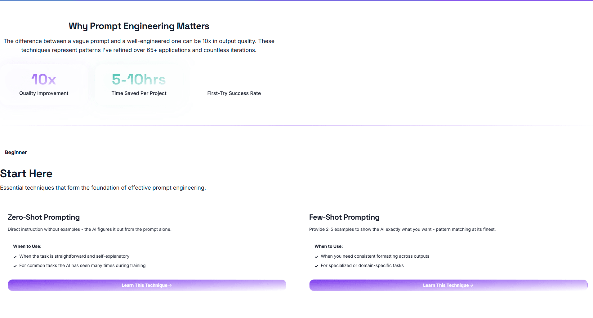
Meta-Prompting in Action: What Happens When You Let Claude Code Redesign Your App
A brutally honest experiment in trusting AI without human oversight
October 26, 202525 min read
Meta-PromptingClaude CodeAI
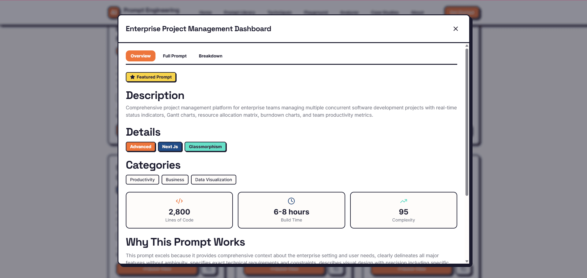
Overview
I can't count the number of times I got pop-up notifications or emails from Anthropic suggesting I check out Claude Code. I confess that I was too comfortable with my established workflow using Claude Projects that I didn't see the need to dig into this new tool.
Then I decided to write a blog post about meta-prompting, a technique where you ask an AI model to help you write better prompts or critique your prompting approach. To effectively write about this, I had to actually experiment with it by combining meta-prompting with two other strategies:
- Prompt Decomposition: Breaking down complex tasks into manageable pieces
- Prompt Chaining: Sequencing prompts to build on each other
I then had Claude Code do the actual work of making real edits to my files. The results of this experiment became the source of inspiration for this case study.
You see, with Claude Code, I had an AI that could read my files, modify my code, and execute complex development tasks—all from my terminal. As a programmer, this was simply mindblowing, and I was eager to see its capabilities pushed to their limits.
In this case study, we'll explore together what worked brilliantly and what broke completely.
The Project
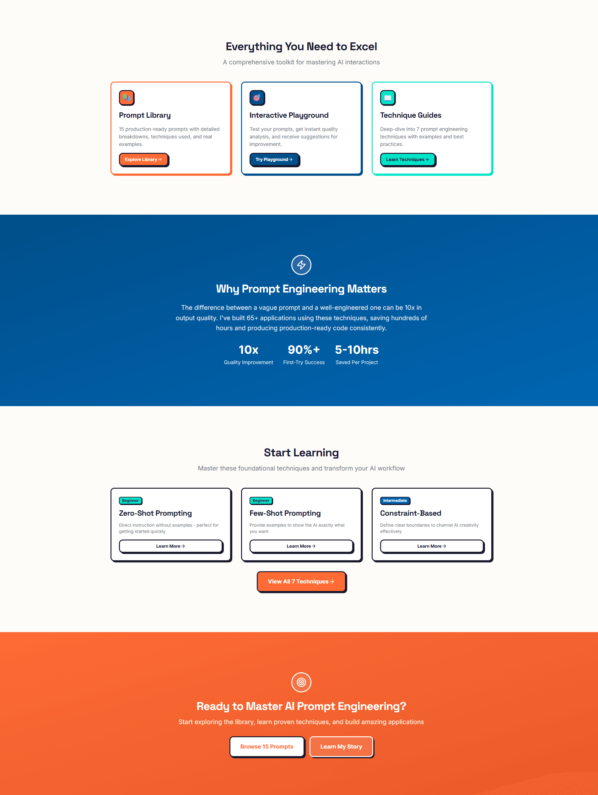
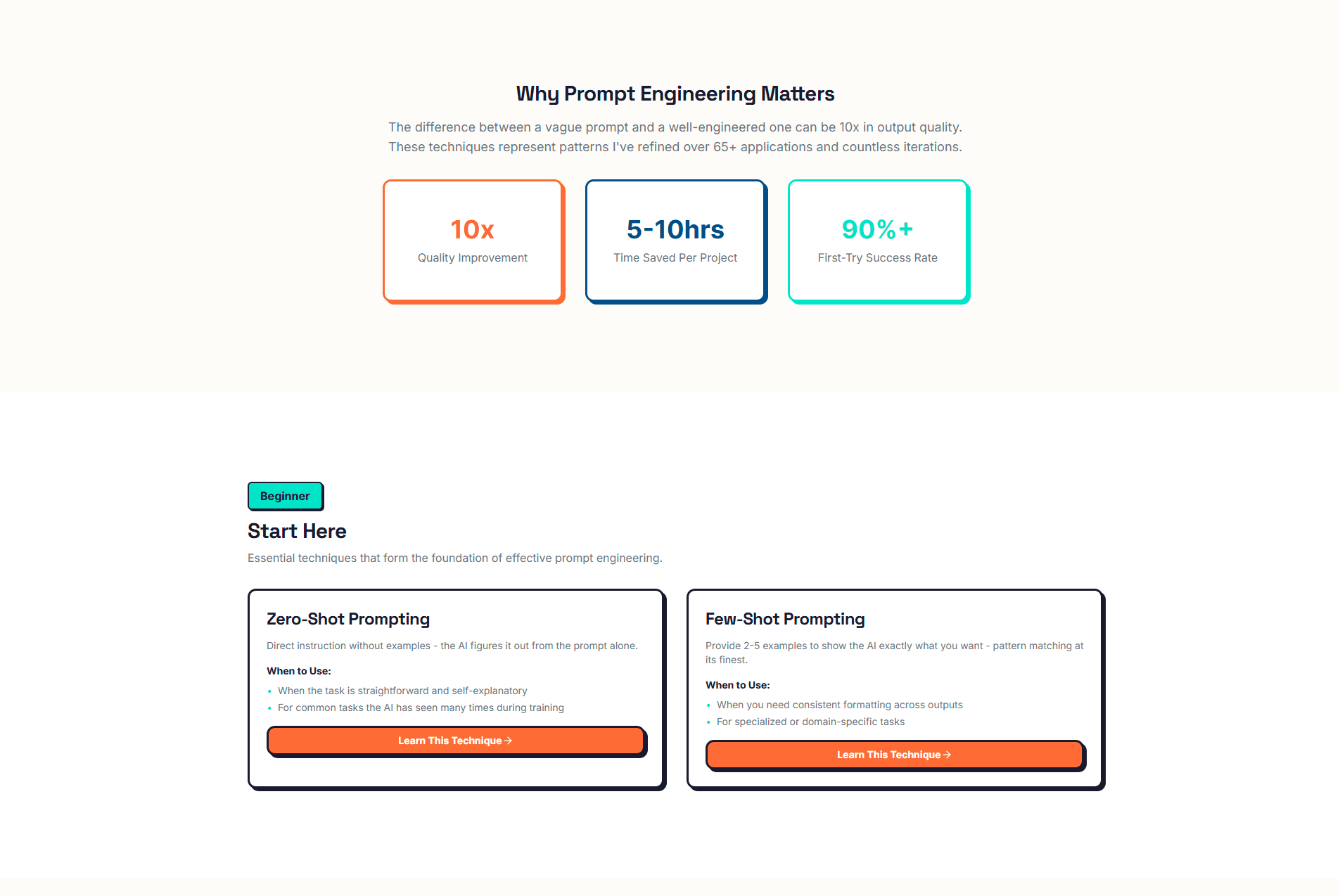
If you're reading this case study, you've hopefully read my blog post where I mentioned working on a project called the Prompt Engineering Toolkit. I even nicknamed it my "Project of Projects."
At the time of this experiment, I had a starter version deployed. For this case study, I attempted to redesign the entire UI/UX of the application using AI with barely any human intervention.
This case study is a comprehensive summary of my findings from this experiment.
Spoiler: It did a really good job... until it didn't.
The Challenge
The initial design of this project used Neobrutalism with gradient accents as its design trend. As I mentioned in the related blog post, I chose this trend because I wanted to create a broad enough visual distinction from this portfolio website, which uses Glassmorphism.
Neobrutalism felt appropriate for an application aimed at portraying serious technical work while still being modern and aesthetically pleasing.
However, I was curious to see how well the AI would perform at redesigning the application to:
- Use the same design trend (Glassmorphism) as my portfolio
- Match the same color themes (purple and teal)
- Make the application more interactive
- Maintain professional polish throughout
The results are interesting, to say the least.
The Constraints
1
Zero Human Intervention During Execution
Once Claude Code began executing prompts, I would not modify code, fix bugs, or adjust implementation, even when problems were visible. This constraint tested whether AI could handle complete design migration independently and identified where human judgment becomes necessary.
2
No Testing Between Prompt Executions
All 14 final prompts ran sequentially without validation or debugging between steps. This constraint stress-tested AI's ability to maintain consistency across dependent tasks and revealed how errors compound without feedback loops.
3
Complete Reliance on Meta-Prompting
Claude (web interface) wrote all prompts for Claude Code, rather than me crafting them manually. This constraint examined whether AI could effectively write instructions for another AI, testing AI-to-AI communication without human refinement.
4
Documentation Only—No Corrections Allowed
My role was strictly observational: document every success and failure, but fix nothing until all prompts completed. This constraint enabled honest assessment of autonomous AI capabilities versus tasks requiring human oversight.
5
Full Design System Migration Scope
The migration had to be comprehensive: design tokens, global styles, component updates, and animations, not just cosmetic changes. This constraint ensured the experiment tested AI across the full spectrum of frontend development: systematic refactoring, design implementation, and contextual decision-making.
These constraints were intentionally extreme to reveal the true boundaries between AI capability and human necessity. By removing all safety nets, I could identify exactly where the technology excels (systematic, rule-based tasks) and where it fails (contextual judgment, aesthetic decisions, edge case handling).
My Approach
I started by installing Claude Code through my terminal, then I sent a message in a chat within a specific project on my Claude account. Here's the exact prompt I provided to Claude:
"I would like to migrate the design system of my Prompt Engineering Toolkit, but I don't want to do that with you exactly. I would like to use Claude Code from within my terminal to accomplish this. So I would like you to design a game plan for accomplishing this migration. Remember, I would like to use the same design trend and theme from my Personal portfolio website while also ensuring that there are a lot of micro-interactive elements on the website that makes it enjoyable to use and gives the user a smooth, soothing experience as they navigate the page. So design the plan and the step-by-step prompts I would have to provide to Claude Code to accomplish this."
How This Approach Fulfills Three Core Prompt Engineering Strategies
Before I share the output, here's a quick breakdown of how this single prompt accomplishes multiple prompt engineering strategies simultaneously:
1. Meta-Prompting: I'm essentially asking Claude to write the exact prompts that I will execute in the terminal using Claude Code. This is AI writing instructions for AI.
2. Prompt Decomposition: My prompt asks the model to design a "game plan," which forces it to break down the mega-task of migrating an entire design system into smaller, manageable pieces.
3. Prompt Chaining: The response provided 13 sequential prompts to achieve this goal, with each prompt building on the results of the previous one.
Note: You'll notice other prompting strategies woven in, such as constraint-based prompting (specifying the design trend, user experience goals, and tool requirements). However, the three strategies above are the foundational approaches that structured this entire experiment.
Prompts Used
Deep Dive
📋 What Claude Code Was Asked To Do
- Analyze the portfolio's design system including CSS variables, glassmorphism utilities, and animation patterns
- Extract all color custom properties (primary purple, secondary teal, accent colors)
- Migrate the complete design token system from the portfolio to the toolkit
- Update globals.css and tailwind.config to match the portfolio's color scheme
- Ensure font families matched between portfolio and toolkit for brand consistency
✅ What Worked Brilliantly
Primary and Secondary Color Extraction
Claude Code successfully identified and implemented the primary purple (#8b5cf6) and secondary teal (#14b8a6) colors throughout the application, creating immediate visual alignment with the portfolio.
Glassmorphism Core Effects
The backdrop-filter blur effects, translucent card backgrounds, and subtle borders were properly implemented, achieving the signature glassmorphism aesthetic that defined the portfolio.
CSS Variable Structure
The model maintained the :root structure for CSS variables and properly set up both light and dark mode color definitions, showing systematic understanding of design token architecture.
Animation Keyframes Implementation
fadeIn, slideUp, and bounce-gentle animations were correctly added to globals.css with appropriate timing functions, providing smooth transitions throughout the interface.
❌ What Broke
Missing Accent Color Palette
The complete accent color palette (shades from #fdf4ff to #581c87 with DEFAULT: #d946ef) defined in the portfolio's tailwind.config.js was barely implemented. These colors appeared minimally only on the Prompt Playground page, representing a failure to capture the full brand color system.
Font Family Mismatch
The portfolio uses specific fonts that create brand cohesion, but the redesigned application used different fonts entirely. This created an immediate visual disconnect, making the two sites appear as separate brands rather than a unified ecosystem.
Light Mode Contrast Issues
A white light or shadow effect appearing from the bottom left of buttons and other elements significantly reduced text readability in light mode. This same white shadow appeared throughout the site, becoming the primary readability issue in the lighter theme.
💡 Why This Happened
Claude Code excelled at extracting obvious, primary design tokens but failed to perform a comprehensive analysis that would catch secondary but equally important elements like the accent color palette and font families. The model likely prioritized the most frequently used colors (primary and secondary) while treating less common colors as optional rather than essential to brand identity. This reveals a key AI limitation: the inability to understand which design elements are critical for brand consistency versus merely decorative. A human designer immediately recognizes that fonts and complete color palettes are non-negotiable for maintaining visual coherence across a brand ecosystem. The light mode contrast issues suggest the model implemented visual effects without testing them across different theme states, demonstrating a lack of contextual quality assurance that humans naturally perform during development.
📋 What Claude Code Was Asked To Do
- Update header component with glassmorphism effects and proper edge spacing
- Implement footer with organized sections, glassmorphic styling, and appropriate contrast
- Create MainLayout with consistent padding and background effects
- Add micro-interactions to navigation links with smooth hover animations
- Ensure responsive spacing that provides breathing room on all screen sizes
✅ What Worked Brilliantly
Glassmorphism Effects on Header
The header successfully implemented backdrop-filter blur and translucent backgrounds, creating the signature frosted glass effect that enhanced the modern aesthetic.
Navigation Link Micro-Interactions
Hover effects on navigation links were smooth and fluid with appropriate underline animations, providing satisfying interactive feedback.
Page Transition Smoothness
The MainLayout component implemented smooth fade-in transitions when navigating between pages, creating a polished navigation experience.
Content Area Spacing
The main content area received appropriate padding and vertical rhythm, making the central portions of pages feel properly structured.
❌ What Broke
Critical Edge Spacing Failure
Both header and footer had leftmost and rightmost elements appearing dangerously close to screen edges, creating the appearance that no margins or paddings were applied. This lack of breathing room produced a cramped, unprofessional look that significantly degraded the application's polish.
Footer Contrast Catastrophe
In light mode, the footer rendered with what appeared to be dark mode styling, resulting in almost zero contrast between text and background. The footer was nearly impossible to read. Ironically, switching to dark mode improved contrast significantly, which is the opposite of expected behavior.
Footer Element Disorganization
Footer elements were scattered and poorly aligned with inconsistent spacing between items. The overall layout felt haphazard rather than deliberately structured, lacking the professional organization expected in a footer component.
💡 Why This Happened
The layout spacing disasters reveal a fundamental AI limitation in contextual design judgment. While Claude Code could apply glassmorphism effects systematically, it failed to understand the implicit requirement that interactive elements need appropriate spacing from screen edges for usability and aesthetics. This type of spacing knowledge is often unwritten in design systems because human designers consider it foundational common sense. The footer contrast issue demonstrates the model's inability to test implementations across different theme states. It likely applied styling that looked correct in one theme without verifying the other theme, showing a lack of quality assurance thinking. The scattered footer layout suggests the model struggled with spatial relationships when multiple elements need coordinated positioning. These failures highlight where AI needs explicit instructions for what humans consider obvious design principles, and where human oversight remains essential for catching issues that require visual judgment and cross-state testing.
📋 What Claude Code Was Asked To Do
- Add floating orbs with bounce-gentle animations (6-second duration) to the homepage hero section
- Implement smooth hover effects on buttons with scale and shadow increases
- Create card hover animations with lift effects (translateY) and shadow depth changes
- Add micro-interactions throughout: icon rotations, underline animations, and scale effects
- Ensure all animations used consistent timing (0.2-0.3s) and appropriate easing functions
✅ What Worked Brilliantly
Card Hover Lift Effects
Cards throughout the application featured smooth hover lift animations that felt satisfying and responsive, enhancing the interactive quality of the interface with appropriate translateY transformations.
Page Transition Smoothness
Fade-in animations when navigating between pages were well-timed and smooth, creating a polished navigation experience without jarring jumps or flashes of content.
Button Interaction Feedback
Primary buttons responded to hover and click events with appropriate scale effects and color transitions, providing clear interactive feedback (particularly visible in dark mode).
Micro-Interaction Consistency
Most interactive elements maintained consistent animation timing around 0.2-0.3 seconds, creating a unified interactive language across the application.
❌ What Broke
Static Floating Orbs
The floating orbs (blurry circular shapes on the homepage) were completely static with zero animation despite explicit instructions for bounce-gentle animations with 6-second durations. They remained fixed on screen as decorative elements without the intended subtle movement.
Light Mode Hover Feedback Loss
Button hover effects that worked well in dark mode (shadow increases, subtle glows) were nearly invisible in light mode due to poor contrast, significantly reducing interactive feedback for users in the lighter theme.
Missing Theme Toggle Initially
Despite implementing both light and dark modes throughout the application, the model completely failed to add a theme toggle button, leaving users with no way to switch themes. This required a mid-migration correction with Prompt 13.
💡 Why This Happened
The static orbs failure reveals an interesting limitation: Claude Code successfully created the visual elements (the orbs exist and are positioned correctly) but failed to apply the requested animations. This suggests the model may have focused on visual output while deprioritizing or misunderstanding animation implementation. The loss of hover feedback in light mode again demonstrates the lack of cross-theme testing. The model likely tested interactions in one theme and assumed they would work identically in the other, missing how contrast differences affect visibility of effects like shadows and glows. The missing theme toggle represents perhaps the most significant oversight: the model created infrastructure for two themes but lacked the contextual awareness to recognize that users need a way to switch between them. A human developer would immediately realize this gap because we naturally think about user workflows and feature completeness. These animation and interaction issues highlight where AI needs more explicit instructions about testing requirements and where human judgment about user experience remains irreplaceable.
📋 What Claude Code Was Asked To Do
- Maintain consistent visual hierarchy and element alignment across all pages
- Apply proper spacing and organization to content sections from top to bottom
- Ensure glassmorphism effects and design quality remained consistent throughout entire pages
- Keep the same level of polish and attention to detail across all content areas
- Implement responsive layouts that work smoothly across different page lengths
✅ What Worked Brilliantly
Hero Section Polish
The top portions of pages, particularly hero sections, consistently featured polished glassmorphism effects, proper text gradients, and well-structured layouts that made strong first impressions.
Prompt Library Grid Organization
The Prompt Library maintained a clear grid system with properly spaced cards and consistent visual hierarchy throughout, demonstrating the model's capability with structured, repetitive layouts.
Simpler Page Consistency
Pages with structured, grid-based layouts (like the Prompts Library) maintained better visual consistency from top to bottom, suggesting the model handles straightforward, repetitive structures more reliably than complex, varied content layouts.
❌ What Broke
Homepage Mid-Scroll Quality Collapse
After scrolling past the features showcase section on the homepage, visual quality deteriorated dramatically. Elements appeared scattered and poorly aligned with inconsistent spacing, creating a chaotic visual hierarchy that looked unfinished.
Techniques Page Layout Disarray
The Techniques page suffered from significant visual hierarchy and alignment problems, particularly in middle to bottom sections. Elements felt arbitrarily placed rather than deliberately structured, with spacing that appeared random instead of systematic.
Long-Form Content Breakdown
Pages with longer, more complex content structures showed progressive quality degradation as you scrolled down. The model struggled to maintain design consistency across extended page lengths, with layout problems becoming more pronounced toward page bottoms.
💡 Why This Happened
The pattern of quality degradation reveals a critical limitation in how AI handles complex, long-form content structures. Claude Code performed well with clearly defined, structured sections (like grids and hero areas) but struggled when faced with varied, flowing content that required contextual layout decisions. The model likely prioritized the most visible areas (top of pages) where first impressions matter, potentially running into token limits or attention span issues with longer pages. This suggests AI treats page sections somewhat independently rather than maintaining holistic awareness of overall page structure. The success with simpler pages (About) versus failures with complex pages (Techniques, Homepage lower sections) indicates the model handles systematic, repetitive patterns better than nuanced, context-dependent layouts. A human designer naturally maintains a mental model of the entire page while working, catching inconsistencies and ensuring visual rhythm from top to bottom. The AI's sectional approach without this holistic perspective results in fragmented quality that deteriorates as complexity increases. This highlights where human oversight becomes essential: reviewing complete pages as unified experiences rather than collections of independent sections.
📋 What Claude Code Was Asked To Do
- Ensure text contrast meets accessibility standards in both light and dark modes
- Implement visible focus states for keyboard navigation
- Create readable glassmorphism effects that don't compromise content legibility
- Maintain appropriate color contrast ratios for all interactive elements
- Balance aesthetic trends with functional usability and accessibility requirements
✅ What Worked Brilliantly
Keyboard Navigation Support
Interactive elements were keyboard accessible with tab navigation working correctly throughout the application, allowing users to navigate without a mouse.
Focus State Visibility
Focus rings on interactive elements like inputs and buttons remained visible, providing clear indication of which element currently has focus for keyboard users.
Dark Mode Text Contrast
Text contrast in dark mode was generally good, with readable text against dark backgrounds throughout most of the application.
No Broken Functionality
Despite visual issues, no core functionality was broken. All links worked, forms functioned, and interactive elements responded appropriately to user input.
❌ What Broke
Critical Light Mode Readability Issues
Multiple contrast problems in light mode made text difficult to read. The white shadow effect on buttons, poor footer contrast, and translucent modal backgrounds significantly impaired readability for users in the lighter theme.
Translucent Modal Accessibility Failure
The Quick View modal on the Prompt Library page used a transparent background with blurred content behind it. While visually interesting, this created significant readability issues, prioritizing aesthetics over accessibility in a learning application where text clarity is paramount.
Reduced Interactive Feedback in Light Mode
Button hover effects (shadows, glows) that worked well in dark mode were nearly invisible in light mode due to poor contrast, reducing the interactive feedback that users rely on to understand clickable elements.
💡 Why This Happened
The accessibility issues reveal AI's tendency to prioritize visual trends over functional usability. Claude Code successfully implemented glassmorphism aesthetics but failed to balance these effects with readability requirements. The model likely tested visual output without considering how effects appear across different backgrounds, lighting conditions, or theme states. The translucent modal exemplifies this: it looks modern and follows the glassmorphism trend, but a human designer would immediately recognize that learning content requires solid backgrounds for readability. This demonstrates a critical gap in AI judgment: understanding context-appropriate design decisions. A modal for displaying educational content has different requirements than decorative UI elements. The light mode contrast failures stem from the same issue - implementing effects in one context (dark mode) and assuming they translate directly to another (light mode) without testing. Human designers naturally consider accessibility as a baseline requirement, recognizing that usability always trumps aesthetics. AI currently treats accessibility more as a checklist item (keyboard navigation, focus states) rather than a holistic design principle that informs every visual decision. This highlights where human oversight remains essential: ensuring that aesthetic implementations never compromise the fundamental user need to access and understand content.
📋 What Claude Code Was Asked To Do
- Maintain TypeScript type safety throughout the migration
- Ensure all component props retained proper type definitions
- Fix any type errors before finalizing the migration
- Run build verification and resolve any compilation errors
- Preserve code quality and type checking while implementing design changes
✅ What Worked Brilliantly
Component API Preservation
All existing component props and APIs were maintained without breaking changes. The migration successfully updated styling without affecting how components were called or used throughout the application.
No Runtime Errors
Despite build-time TypeScript errors, the application ran without runtime errors once the type issues were fixed, indicating that the logic and functionality remained sound.
Systematic Refactoring Capability
The model demonstrated capability for large-scale refactoring, updating numerous files systematically while generally maintaining the application's structure and patterns.
❌ What Broke
TypeScript 'any' Type Violations
Multiple files used the 'any' type inappropriately, particularly in LazyLoadWrapper.tsx (lines 6 and 8) and performance.ts. These violations compromised type safety, allowing potential runtime errors to slip through TypeScript's type checking.
Module Not Found Error
A MODULE_NOT_FOUND error for the 'critters' package prevented the build from completing. The build process attempted to access a package that wasn't properly installed or configured.
Build Failure Requiring Manual Fixes
The application failed to build after all 14 prompts were executed, requiring manual intervention to replace 'any' types with proper type definitions like ComponentType<Record<string, unknown>> and [key: string]: unknown before the build would succeed.
💡 Why This Happened
The build errors reveal a critical limitation: while AI can execute design migrations effectively, it may compromise code quality and type safety in the process. Claude Code likely used 'any' types as a shortcut to avoid dealing with complex type definitions, prioritizing getting the visual changes working over maintaining strict type safety. This represents a fundamental difference in how AI and humans approach development. Human developers understand that type safety is not just a compilation requirement but a critical tool for preventing bugs and maintaining code quality long-term. They resist using 'any' except as a last resort. The model treated TypeScript more as an obstacle to work around rather than a valuable constraint that improves code reliability. The missing module error suggests the model may have introduced or modified dependencies without properly updating package configurations. The build failure requiring manual fixes highlights why human oversight remains essential even after AI completes a task. AI can execute instructions and make changes systematically, but it lacks the judgment to ensure production readiness, proper type safety, and adherence to best practices. This experiment demonstrates that AI is excellent for executing well-defined tasks but requires human developers to verify quality, fix type safety issues, and ensure the codebase remains maintainable and robust.
Before & After
Homepage Hero Section & Navigation
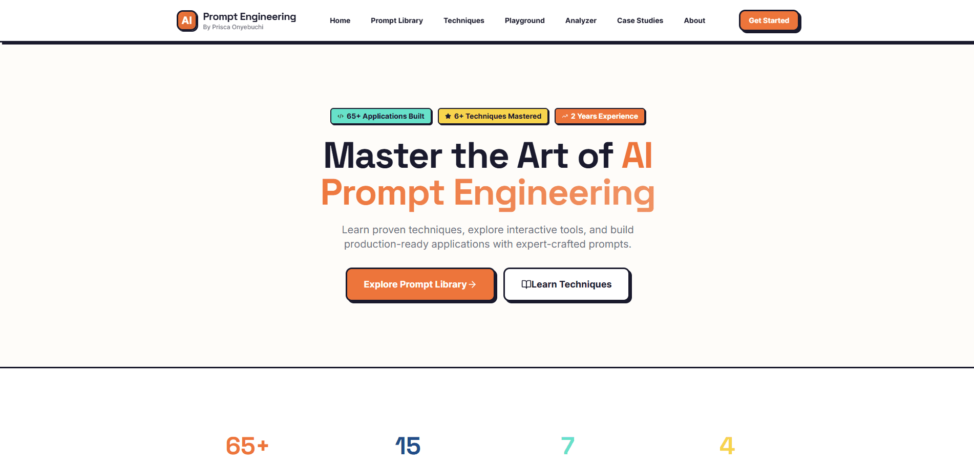
Before
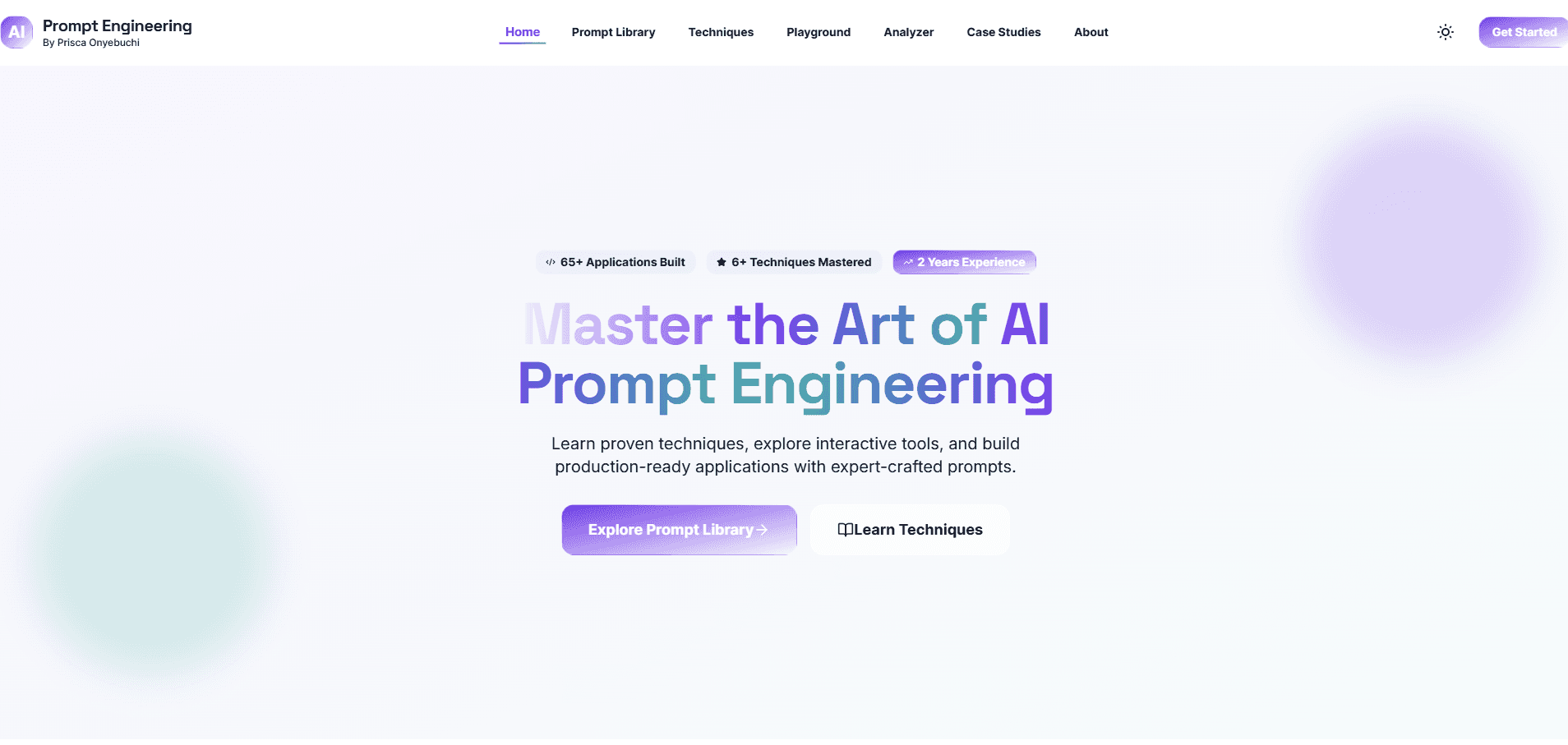
After
Before
Original neobrutalism design with bold borders, high contrast, and sharp corners. Header elements properly spaced from edges.
After
New glassmorphism design with floating orbs (static, no animation), text gradients, and translucent effects. Notice header elements too close to screen edges lacking proper margins.
The homepage hero successfully transitioned to glassmorphism with gradient backgrounds and floating orbs positioned correctly. However, the orbs remained completely static despite explicit instructions for 6-second bounce-gentle animations. The header shows critical edge spacing issues with elements appearing cramped against screen boundaries.
Footer Layout & Contrast Issues
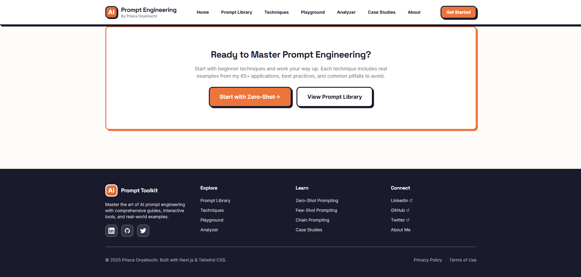
Before
After
Before
Original footer with organized sections, proper spacing, and clear text contrast in both themes.
After
Redesigned footer with scattered elements, poor spacing, and critical contrast failure in light mode (appears with dark mode styling). Dark mode ironically shows better contrast than light mode.
The footer represents one of the most problematic areas of the redesign. Elements are scattered and poorly aligned with inconsistent spacing throughout. In light mode, the footer renders with what appears to be dark mode styling, creating almost zero text contrast and making it nearly impossible to read. Paradoxically, switching to dark mode improves contrast significantly. Edge spacing issues are evident with elements too close to screen boundaries.
Prompt Library Cards & Grid Layout

Before

After
Before
Card grid with bold neobrutalism styling, thick borders clearly defining card boundaries.
After
Glassmorphism cards with translucent backgrounds, subtle borders, and smooth hover lift effects. Cards maintain good spacing and clear grid structure.
The Prompt Library successfully implemented glassmorphism card styling with appropriate translucent backgrounds and backdrop-filter blur effects. The grid layout maintains good organization and consistent spacing between cards. Hover effects work smoothly with satisfying lift animations. However, the borders are perhaps too subtle, making it slightly harder to distinguish where one card ends and another begins without the hover effect or proper card organization.
Quick View Modal - Translucent Background Issue
Before
After
Before
Original modal with solid background ensuring text readability against any page content.
After
Redesigned modal with translucent/transparent background creating glassmorphism effect. While visually interesting, blurred content behind modal significantly reduces text readability, especially for learning content.
The Quick View modal demonstrates AI's tendency to prioritize aesthetic trends over functional usability. The translucent background with blurred content behind it follows the glassmorphism trend but creates significant readability issues. In a learning application where users need to read prompt details, overview, and breakdowns, a solid background is essential for accessibility. This represents a failure to understand context-appropriate design decisions where readability must always trump aesthetics.
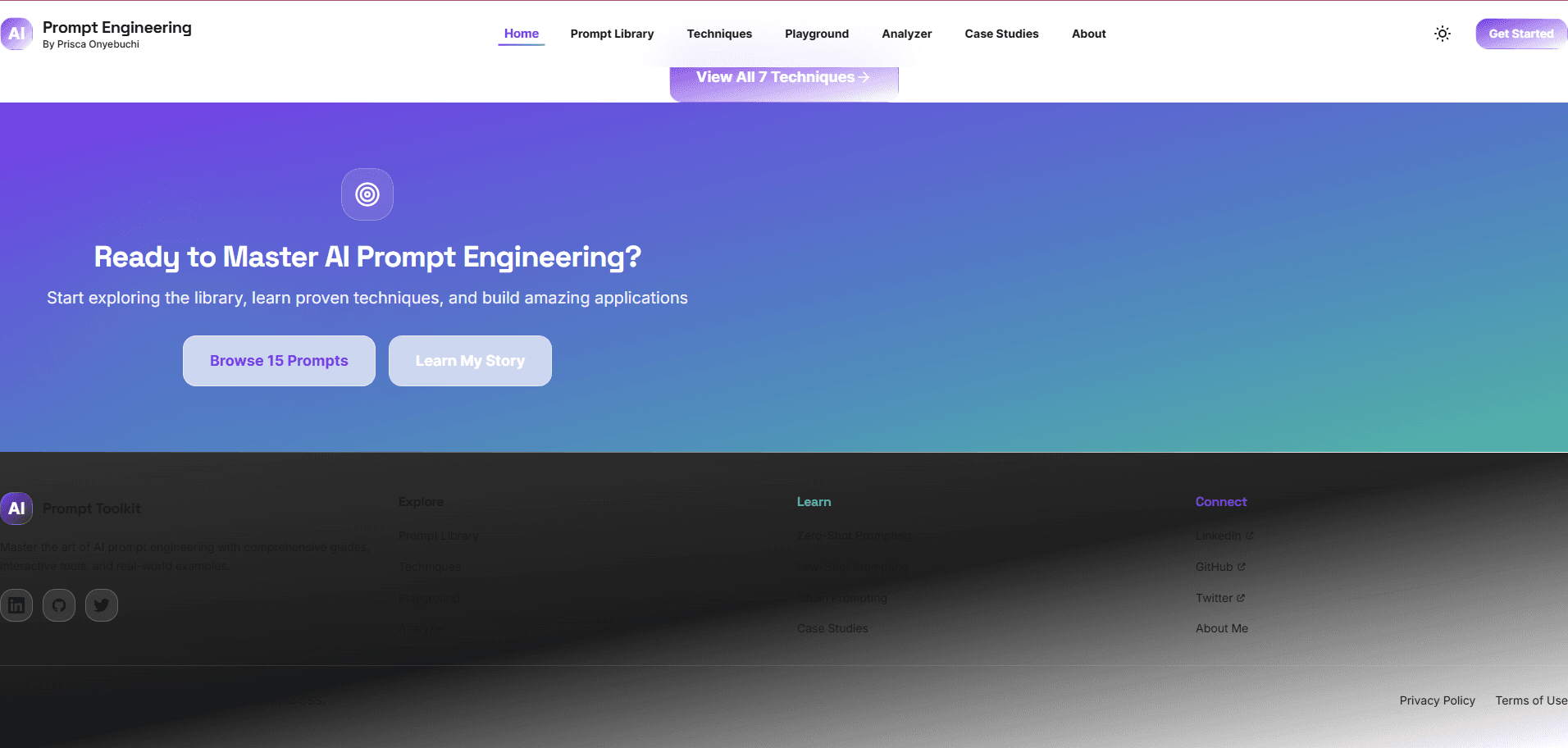
Homepage Lower Sections - Quality Degradation
Before

After
Before
Original lower homepage sections with organized layout and consistent spacing throughout.
After
Redesigned lower sections showing scattered elements, inconsistent spacing, and poor alignment. Visual hierarchy becomes chaotic compared to polished hero section above.
This comparison reveals the progressive quality degradation pattern. While the homepage hero section (top) maintained excellent polish, scrolling past the features showcase reveals dramatically deteriorated quality. Elements appear scattered with inconsistent spacing and poor alignment, creating a chaotic visual hierarchy. This demonstrates AI's struggle to maintain design consistency across longer, more complex page structures, treating sections somewhat independently rather than maintaining holistic page awareness.
Techniques Page - Mid-Page Layout Breakdown
Before
After
Before
Original techniques page with clear visual hierarchy and organized content sections from top to bottom.
After
Redesigned page showing good quality at top but significant visual hierarchy and alignment problems in middle to bottom sections. Elements feel arbitrarily placed with random spacing.
The Techniques page exemplifies how AI struggles with complex, long-form content. The top portion maintains reasonable quality with proper glassmorphism effects and text gradients. However, middle to bottom sections show severe layout disorganization with elements that appear arbitrarily placed rather than deliberately structured. Spacing feels random instead of systematic, and visual hierarchy becomes unclear. This pattern across multiple complex pages reveals AI's sectional approach without holistic page-level awareness.
Key Findings
AI Excels at Systematic, Rule-Based Design Implementation
Claude Code demonstrated impressive capability for executing well-defined design patterns consistently across multiple components, successfully implementing glassmorphism effects, color systems, and animation frameworks when given clear specifications.
AI Lacks Contextual Design Judgment and Cross-State Testing
The most significant failures occurred when contextual judgment was needed: implementing effects without testing across theme states, missing font consistency requirements, creating translucent modals that compromised readability, and failing to recognize when aesthetic choices conflicted with accessibility needs.
Visual Quality Degrades with Page Complexity and Length
Pages maintained excellent polish in hero sections and structured grids but showed progressive quality degradation in middle and lower sections. Complex, long-form content revealed AI's struggle to maintain holistic design awareness across extended page structures.
AI Misses Implicit Design Requirements and Common Sense Spacing
Critical failures occurred with unstated but fundamental design principles: missing edge spacing in headers and footers, failing to match font families for brand consistency, forgetting to add a theme toggle despite implementing dual themes, and omitting requested animations while creating the visual elements.
AI Prioritizes Visual Output Over Code Quality and Type Safety
While the design migration was visually successful in many areas, the codebase accumulated TypeScript type safety violations, inappropriate use of 'any' types, and build errors that prevented production deployment without manual intervention to fix type definitions.
The Optimal Model: AI for Execution, Humans for Judgment and QA
This experiment revealed the ideal collaboration model: AI excels at systematic execution of well-defined tasks (80% of repetitive work), while human oversight remains essential for contextual judgment, quality assurance, accessibility verification, and catching edge cases (the critical 20%).
Download Resources
All 14 Prompts Used - English Version
Complete collection of all 14 prompts used in the design migration experiment, including the bonus theme toggle prompt. Includes usage instructions and key learnings.
pdf137 KB
All 14 Prompts Used - French Version
Complete collection of all 14 prompts (in English) with French instructions and explanations. Perfect for French-speaking developers wanting to replicate the experiment.
pdf140 KB